Native disclosure with details and summary
Build an HTML disclosure with details and summary, preserve native state and focus, and choose grouping and animation only when the content needs them.

The details element provides a disclosure control that can reveal supporting content without requiring JavaScript for its basic operation. Its summary supplies the visible label. For a developer who already knows basic HTML, a short shipping FAQ is a useful first case: the browser manages the open state and gives the summary built-in keyboard interaction.
Use disclosure for information that readers can choose to expand. Do not hide the only explanation of a destructive action or a required form instruction behind it. Collapsing content changes when a reader encounters it, so the choice should follow the content’s importance rather than a desire to make every page shorter.
Begin with useful summary text
<details class="shipping-faq" id="delivery-date">
  <summary>Can I choose a delivery date?</summary>
  <p>
    In this example shop, the checkout shows available dates
    before the order is submitted. Availability depends on
    the delivery area.
  </p>
  <p><a href="/delivery-policy/">Read the delivery policy</a></p>
</details>
This is a fictional policy written to demonstrate the component. A real store must replace it with its actual delivery terms. The question makes sense while the disclosure is closed, and the answer provides the information the reader requested.
The MDN details reference describes the summary and open state. For valid author markup, put the summary first inside the details element. The browser locates a summary child for its native behavior, but that behavior is not permission to put other content before the summary. If you omit a meaningful summary, the browser’s fallback label cannot describe your specific content well.
The open attribute is Boolean. Its presence opens the disclosure; writing open=“false” still leaves the attribute present and therefore does not mean closed. Remove the attribute or set the DOM open property to false when controlling it programmatically.
Let the browser own the basic state
A common mistake is to add a click listener that toggles a second Boolean and then use that Boolean to compete with the native open state. The two can drift when the user interacts through the keyboard or when another script changes the element.
If application code needs to observe state changes, listen for the toggle event and read the element’s current open property. Notifications can be coalesced when state changes repeatedly before the browser dispatches the event. Treat the final state as the source of truth rather than counting events as if each represented one irreversible user action.
Analytics also needs this distinction. A disclosure being opened by initialization code is not necessarily a reader choosing to open it. If the measurement matters, define which interaction you intend to count and record it at the appropriate boundary. Merely observing a state change does not establish user intent.
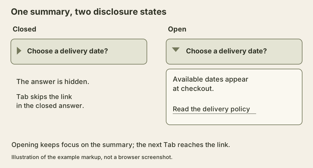
The label stays present in both states. That continuity helps readers understand what expanded, and it gives them a stable control for closing the content again.
Style the control without hiding its meaning
The browser’s disclosure marker is useful. If a design replaces it with a custom chevron, keep the expanded and collapsed states visually distinguishable. Do not show a plus icon that remains unchanged after expansion while expecting readers to infer the state from a long page movement.
Preserve a visible focus indicator on the summary. A hover color does not help someone navigating with the keyboard. Padding can make the summary easier to activate without adding a separate nested button. Keep the label and indicator inside one coherent target.
Be cautious about placing other interactive controls inside the summary. A link or button there can create competing activation behavior and confusing names. If the answer contains a support link, put that link in the disclosed content. If the summary itself must contain several independent actions, a different component structure is probably easier to explain.
Animations are optional. A height animation has to cope with content whose size changes, and it can delay access to the answer. The native element does not automatically supply a smooth opening animation. Add motion only after the static behavior works, and honor reduced-motion preferences.
Give the native target room to work
The following styles belong to the example above. The summary keeps its native display and marker; the CSS adds a larger target, wrapping and a visible keyboard focus outline. The answer remains ordinary content, including a separate link to the fictional policy route. Supply that route in a real site before publishing the example.
.shipping-faq {
  border: 1px solid #74785b;
  border-radius: 0.75rem;
  margin-block: 1rem;
}

.shipping-faq > summary {
  cursor: pointer;
  padding: 1rem;
  overflow-wrap: anywhere;
}

.shipping-faq > summary:focus-visible {
  outline: 3px solid #485b34;
  outline-offset: 3px;
}

.shipping-faq > :not(summary) {
  margin: 1rem;
}
There is no fixed height to cut off a question after translation or text enlargement. There is also no overflow clipping on the outer box that could hide the outline. With the answer closed, keyboard navigation should reach the summary and skip its hidden support link. After opening, the next Tab should reach that link in the normal document order. The component does not need to force focus into the answer just because its height changed.
Keep a heading for the FAQ section outside the summary when it describes the whole group. The summary reference documents differences in how browsers expose summary descendants to assistive technology. A heading placed inside a summary is therefore not a dependable shortcut for both section navigation and a disclosure label. Native behavior is a starting point; check the browser and screen-reader combinations the site actually supports.
Observe the state instead of replaying clicks
Here is a small diagnostic listener for the delivery example. Paste it once in the browser console after the page loads, or run it from a script placed after the markup. It records state notifications without cancelling activation or adding a second expanded-state variable.
const disclosure = document.querySelector('#delivery-date');
const observed = [];

disclosure.addEventListener('toggle', () => {
  observed.push(disclosure.open);
  console.log({ open: disclosure.open, notifications: observed.length });
});
Begin with the disclosure closed and any previous notification already delivered. In one console evaluation, run these three assignments:
disclosure.open = true;
disclosure.open = false;
disclosure.open = true;
The final property is true immediately. The browser can coalesce the queued toggle notifications, so this uninterrupted sequence produces one notification of the final open state, rather than an event log of all three assignments. The toggle documentation describes this coalescing behavior. Do not use notification count to reconstruct every intermediate state or to count purchases, reader decisions or other application actions.
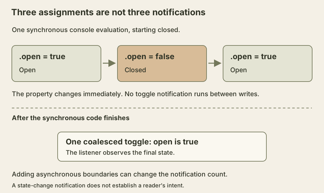
The diagram separates property changes from later notification. If you insert asynchronous boundaries, the browser may deliver a notification between assignments. That is a different experiment: preserve those boundaries when explaining the observed count. The example does not promise a fixed delay in milliseconds.
Try disclosure.setAttribute('open', 'false') next. The answer remains open because the attribute exists. Then set disclosure.open = false and inspect disclosure.hasAttribute('open'); the result is false. This exercise connects Boolean HTML syntax to the reflected DOM property. The literal word inside an attribute is not an application Boolean parser.
Decide whether several answers may stay open
An FAQ is often easier to compare when several disclosures can remain open at once. A mutually exclusive accordion can save space, but it also closes information the reader may still be using. Choose the behavior intentionally rather than assuming that every group needs exclusivity.
Modern details grouping can use a shared name to permit only one open disclosure in a group where supported. The HTML specification defines this exclusivity across matching group names, even when elements are not adjacent. Use a name specific to this FAQ so a second component elsewhere does not unexpectedly join its group. Keep related questions together under an appropriate section heading. Compatibility still belongs in your test plan. If older supported browsers keep several sections open, that can be an acceptable enhancement fallback for an FAQ, provided the content remains readable and the instructions do not promise exclusivity.
Avoid using grouping to hide a required sequence of tasks. A multi-step form needs navigation, validation, and state management that a disclosure group does not provide. Similar appearance does not imply the same interaction contract.
Test the content as well as the toggle
Navigate to each summary with the keyboard and open it using supported native activation keys. Check that focus remains visible and that opening one answer does not unexpectedly move focus elsewhere. At increased text size, long summary labels should wrap without placing the marker over the words.
Read the page with all disclosures open. This catches duplicate answers, missing context, and links whose labels depend on information hidden in another section. It also shows whether the underlying content is still organized well once the space-saving effect disappears.
For printing, decide whether readers need the answers expanded. Browser print behavior and project styles should be checked together. A printed FAQ containing only questions is not useful simply because the interactive version worked on screen.
The final component can remain almost entirely HTML and CSS. Add scripts for a demonstrated requirement, while keeping the summary, content, and native state understandable on their own.