Sticky headers and the scroll container you forgot
Predict a sticky label’s position, find hidden scroll ancestors, and preserve fragment and keyboard visibility in a working reading panel.

A section label can have perfectly valid sticky CSS and still disappear when you scroll. The useful first question is which box supplies its scroll reference. The second is which box limits its travel. Those can be different ancestors, and a clipping wrapper can change the first without making an obvious scrollbar appear.
This lesson is for a frontend developer who understands the box model and ordinary document flow. We build a small reading panel, predict a label’s position at specific scroll offsets, switch an intervening wrapper between overflow modes, and follow real fragment links with the keyboard. The measurements concern this horizontal, untransformed example, not every writing mode or a complete accessibility audit.
Make the intended scrolling region explicit
Use this markup in a standalone page with <meta name="viewport" content="width=device-width, initial-scale=1">. The panel has a visible name and a tab stop so a keyboard user can focus and scroll it. Its chapter labels and note headings retain their native hierarchy. The two jump links target focusable headings inside the panel; each chapter also contains a link to notes outside it.
<main class="sticky-demo">
  <h1>Find the box that controls sticky</h1>
  <label for="overflow-choice">Wrapper overflow</label>
  <select id="overflow-choice">
    <option value="visible">visible</option>
    <option value="hidden">hidden</option>
    <option value="clip">clip</option>
    <option value="x-hidden">overflow-x: hidden</option>
  </select>
  <nav aria-label="Jump within the reading panel">
    <a href="#first-note">First note</a>
    <a href="#second-note">Second note</a>
  </nav>
  <h2 id="reader-label">Reading panel</h2>
  <div class="reader" tabindex="0" role="region" aria-labelledby="reader-label">
    <div class="reader-content" data-overflow="visible">
      <p class="reader-lead">Start</p>
      <section class="chapter">
        <h3 class="chapter-label">Part 1</h3>
        <div class="chapter-content">
          <h4 id="first-note" tabindex="-1">A note about boundaries</h4>
          <p>A label can stay near the panel edge while its own section passes underneath it.</p>
          <a href="#reader-notes">Open the reading notes</a>
        </div>
      </section>
      <section class="chapter">
        <h3 class="chapter-label">Part 2</h3>
        <div class="chapter-content">
          <h4 id="second-note" tabindex="-1">A note about another section</h4>
          <p>The next section has its own label. The previous label must leave with its section.</p>
          <a href="#reader-notes">Open the reading notes</a>
        </div>
      </section>
    </div>
  </div>
  <p id="reader-notes" tabindex="-1">The panel and its wrapper are different boxes. A range can end even when the page has more content.</p>
</main>
The four-rem lead-in makes the first sticky threshold easy to observe. Each chapter body has a minimum height, leaving a useful distance over which its label can travel. These are teaching dimensions rather than a suggested height for every reading interface.
body { margin: 0; }
.sticky-demo {
  max-inline-size: 44rem;
  margin-inline: auto;
  padding: 1rem;
  font-family: system-ui, sans-serif;
  line-height: 1.5;
  color: #303326;
  background: #f4f0e6;
  overflow-wrap: anywhere;
}
.sticky-demo * { box-sizing: border-box; }
select { font: inherit; max-inline-size: 100%; }
nav { display: flex; flex-wrap: wrap; gap: .5rem 1rem; margin-block: 1rem; }
.reader {
  inline-size: min(100%, 40rem);
  block-size: 18rem;
  overflow: auto;
  border: 2px solid #77824d;
  scroll-padding-block-start: 3.5rem;
  scroll-behavior: auto;
}
.reader-content { display: flow-root; }
.reader-content[data-overflow="hidden"] { overflow: hidden; }
.reader-content[data-overflow="clip"] { overflow: clip; }
.reader-content[data-overflow="x-hidden"] { overflow-x: hidden; }
.reader-lead { margin: 0; block-size: 4rem; padding: .5rem 1rem; }
.chapter-label {
  position: sticky;
  inset-block-start: .5rem;
  z-index: 1;
  margin: 0;
  padding: .5rem 1rem;
  font-size: 1rem;
  line-height: 1.5;
  background: #d5dcc1;
  box-shadow: inset 0 -1px #77824d;
}
.chapter-content {
  min-block-size: 26rem;
  padding: 1rem;
  display: flex;
  flex-direction: column;
  gap: 1rem;
}
.chapter-content h4, .chapter-content p { margin: 0; }
.chapter-content a { margin-block-start: auto; }
a { color: inherit; text-underline-offset: .15em; }
a:focus-visible, select:focus-visible, [tabindex]:focus-visible {
  outline: 3px solid currentColor;
  outline-offset: 3px;
}
The label stays in normal flow. Sticky positioning changes where it is painted without making its following content occupy the label’s original space. The inset supplies the threshold; MDN’s position reference explains that an axis with both insets left at auto behaves like relative positioning on that axis.
Place the script after the markup. Changing the native select resets the panel to its start so each mode can be compared from the same position. With JavaScript unavailable, the initial visible-overflow layout and all four links remain usable.
const overflowChoice = document.querySelector('#overflow-choice');
const reader = document.querySelector('.reader');
const readerContent = reader.querySelector('.reader-content');
function updateOverflow() {
  readerContent.dataset.overflow = overflowChoice.value;
  reader.scrollTop = 0;
}
overflowChoice.addEventListener('change', updateOverflow);
updateOverflow();
Calculate the first label’s travel
The sticky-positioning rules constrain the label against the nearest scrollport while keeping its position box inside its containing block. A scrollport is the visible window of a scroll container. Here .reader supplies that window and the first .chapter supplies the label’s containing block while the wrapper uses visible overflow.
At a sixteen-pixel root and enough width for the short label to occupy one line, the lead-in is 64 pixels. The label is forty pixels tall: twenty-four for its line and sixteen for vertical padding. Its body is 416 pixels tall while the minimum height governs. The chapter therefore starts at 64 and ends at 520 in the panel’s unscrolled content coordinates.
Call the panel’s scroll offset s. Without sticky movement, the label’s top would be 64 - s. The eight-pixel inset prevents it moving above eight while there is enough room in its chapter. The chapter’s ending edge imposes the other limit: the label’s top cannot exceed 520 - s - 40 if its bottom is to stay inside the chapter.
For these zero-margin boxes with only a start inset, the resulting top relative to the panel’s inner border edge is min(max(64 - s, 8), 480 - s).
| Panel scroll s | Label top | What controls it |
|---|---|---|
| 0 | 64 | Normal position |
| 40 | 24 | Normal position |
| 96 | 8 | Start inset |
| 472 | 8 | Inset meets the chapter limit |
| 500 | -20 | Chapter ending edge |
At scroll 500, part of the label has left the visible panel. This is the intended release as its section ends. Increasing z-index cannot extend the chapter. The next label has its own containing block and its own movement.
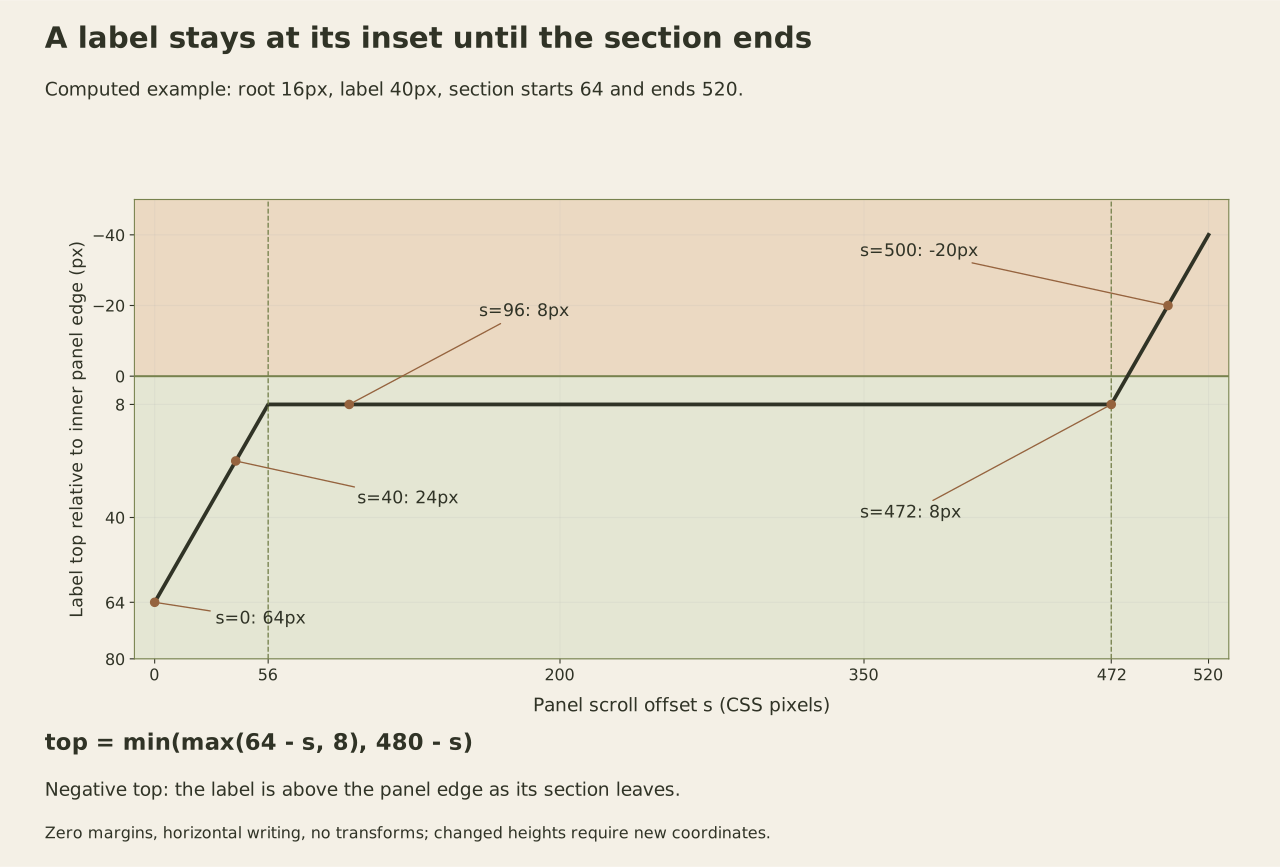
If enlarged or wrapped content makes the chapter taller, measure its actual ending edge before reusing these numbers. The forty-pixel label and 520-pixel ending coordinate are properties of this particular layout, not constants built into sticky positioning.
A wrapper can become the reference without visibly scrolling
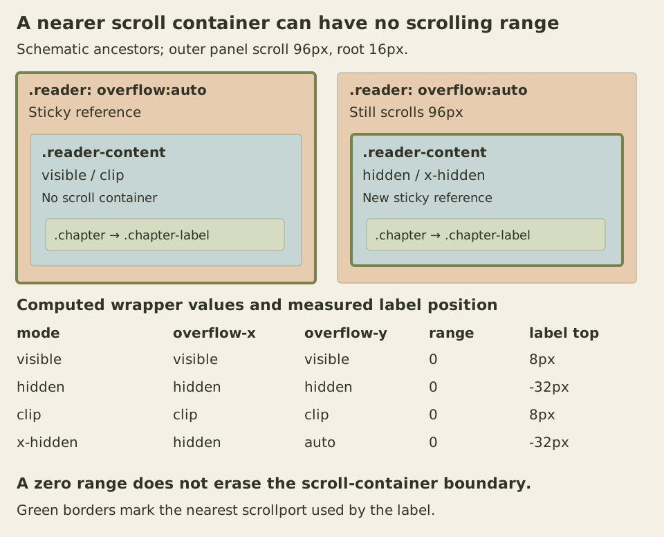
Choose hidden in the select and scroll the outer panel again. CSS Overflow defines hidden as a scrollable overflow value: direct scrolling controls are withheld, but programmatic scrolling remains possible. A hidden-overflow box is still a scroll container.
Our wrapper grows to its contents. Its own scroll range is zero, so its scroll position does not change as the outer panel moves. Nevertheless, it becomes the label’s nearest scrolling ancestor. The label now follows that wrapper’s coordinate system instead of sticking to the panel’s edge. At an outer scroll of 96, its top is minus thirty-two rather than eight.
Clip has a different contract. It forbids scrolling through any mechanism and does not create a scroll container. In the clip mode, the outer panel remains the relevant scrolling ancestor. The example explicitly uses flow-root on the wrapper in every mode; clip alone would not establish the formatting context that hidden establishes. Replacing hidden with clip in an existing component therefore requires checking both scrolling and formatting responsibilities.
The last mode sets only overflow-x to hidden. Its initially visible overflow-y computes to auto because of the cross-axis rule in the same specification. Read the computed values rather than assuming the missing overflow-y declaration means there is no vertical scroll boundary.
Run this console diagnostic after loading the page. It changes only the wrapper mode and panel offset, and restores both even if producing the table fails. It does not change the select’s chosen value.
(() => {
  const panel = document.querySelector('.reader');
  const wrapper = panel.querySelector('.reader-content');
  const label = panel.querySelector('.chapter-label');
  const root = parseFloat(getComputedStyle(document.documentElement).fontSize);
  const previousMode = wrapper.getAttribute('data-overflow');
  const previousScroll = panel.scrollTop;
  const rows = [];
  try {
    for (const mode of ['visible', 'hidden', 'clip', 'x-hidden']) {
      wrapper.dataset.overflow = mode;
      panel.scrollTop = 6 * root;
      const style = getComputedStyle(wrapper);
      const portTop = panel.getBoundingClientRect().top + panel.clientTop;
      rows.push({
        mode,
        overflowX: style.overflowX,
        overflowY: style.overflowY,
        wrapperRange: wrapper.scrollHeight - wrapper.clientHeight,
        panelScroll: panel.scrollTop,
        labelTop: label.getBoundingClientRect().top - portTop
      });
    }
    console.table(rows);
    return rows;
  } finally {
    if (previousMode === null) wrapper.removeAttribute('data-overflow');
    else wrapper.setAttribute('data-overflow', previousMode);
    panel.scrollTop = previousScroll;
  }
})();
At the same wide, sixteen-pixel-root layout, visible and clip report a label top of eight. Hidden and x-hidden report minus thirty-two. Every wrapper range is zero. The latter result is exactly why looking only for a visibly moving scrollbar misses the problem.
Separate travel space from painting order
Wrap only the first label in a new ordinary div, leaving its chapter body outside that div. The new containing block is only as tall as the label. It has no useful room for the downward sticky adjustment; at scroll 96 the label again sits at minus thirty-two. This resembles the overflow failure visually, but the lost boundary is different.
A stretched grid or flex item can create a related geometry problem by occupying the available height itself. Before applying align-self or another alignment rule, compare the item’s used height with its containing block. A short wrapper and an oversized item need different layout decisions.
Sticky positioning creates a stacking context. The background and small z-index in this example let the label paint clearly over passing content. They do not activate a missing inset, remove an intervening scroll container or create travel space. Raising the hidden-wrapper label to z-index 9999 still leaves its measured top at minus thirty-two.
The specification also accommodates a sticky box taller than its view rectangle by reducing the effective ending inset, possibly below zero. That rule does not guarantee a comfortable reading area below a large header. Short panels and enlarged labels still need a deliberate layout decision, including allowing a label to scroll normally when persistence consumes too much space.
Leave room when navigation targets content
Scroll padding defines an optimal viewing region for scrolling operations even when scroll snapping is disabled. It does not add layout padding or change the sticky inset. This panel reserves 3.5rem: a half-rem inset, a 2.5rem single-line label and another half-rem of breathing room.
With the wide sixteen-pixel-root layout, activating either jump link places its note heading 56 pixels below the panel’s inner top edge. The active label’s bottom is at 48, leaving eight pixels clear. The tabindex of minus one lets the fragment heading receive focus without adding another sequential tab stop. The next Tab reaches the chapter’s ordinary notes link.
This clearance depends on the label’s height. During enlarged-text testing, the longer Vietnamese label “Phần một” wrapped under added letter and word spacing. Its height became 128 pixels at a thirty-two-pixel root, so a 112-pixel reservation no longer cleared the label’s bottom at 144. That case needs at least 160 pixels for the same sixteen-pixel breathing room. The supplied short labels fit one line in the checked layouts; replacing their text requires checking the contract again.
A changing production header can derive clearance from its measured height, or the design can stop making it sticky when space becomes insufficient. Scroll margin is another tool when the extra space belongs to particular targets. Combining it with scroll padding adds distinct reservations, so inspect the actual result rather than copying one desktop offset everywhere.
For an exercise, reproduce the five position rows, the four overflow modes and the short-wrapper failure. Then use Tab, ArrowDown and Enter to operate the real controls and links at 320 CSS pixels, with larger default text and additional text spacing. Check the focused target and its entire outline as well as the outer panel. Those observations identify which boundary failed before you change the layout.