Responsive images without sending a poster to a phone
Calculate card widths and pixel-density requirements, then use srcset and sizes to describe real image candidates without confusing selection with CSS.

Responsive images let a browser choose among resources according to the image’s displayed size and the device’s pixel density. CSS controls the displayed box. The srcset and sizes attributes describe candidate resources and the expected width of that box. They need to agree with the layout to avoid unnecessary downloads or visibly soft images.
The useful starting point is arithmetic. Before adding an image optimization service, calculate how wide a card actually appears. That gives you a reason for each candidate rather than a list of arbitrary export sizes.
Derive the card width
Consider an illustrative grid with 16 CSS pixels of padding on each side. Below a 48rem breakpoint it has one column. Above that breakpoint it has two columns with a 24-pixel gap. Its total width never exceeds 1200 pixels, and the grid includes its padding within that width.
With a 16px initial font, the 48rem breakpoint is 768 pixels. At a 376-pixel viewport, a single card is 376 minus 32, or 344 CSS pixels wide. At a 1000-pixel viewport, the two cards share 1000 minus 32 minus 24 pixels, so each is 472 pixels wide. Once the grid reaches 1200 pixels, each card is 572 pixels wide.
<img
  src="/images/bouquet-640.webp"
  srcset="/images/bouquet-400.webp 400w,
          /images/bouquet-640.webp 640w,
          /images/bouquet-800.webp 800w,
          /images/bouquet-1200.webp 1200w"
  sizes="(min-width: 48rem) and (min-width: 1200px) 572px,
         (min-width: 48rem) calc((100vw - 56px) / 2),
         (min-width: 1200px) 1168px,
         calc(100vw - 32px)"
  width="1200" height="900"
  alt="Yellow and white flowers arranged in a ceramic vase">
The two-column cap condition checks both breakpoints. If the browser’s initial font is 32px, 48rem becomes 1536px, so a 1280px viewport still has one column. The grid has already reached its 1200px cap, leaving a 1168px image slot after padding. The third sizes branch covers that case. Advertising 572px simply because the viewport passed 1200px would underestimate the slot. Keep the media conditions consistent with the CSS even when a reader changes their initial font settings.
The resources are hypothetical exports with the same crop and aspect ratio. Each width descriptor must match the resource’s actual intrinsic pixel width. A filename containing 800 does not make an image 800 pixels wide; verify the file itself.
The MDN responsive-images guide explains the roles of candidate widths and source sizes. The browser uses this information during resource selection, potentially before the complete CSS layout is available.
Pixel density changes the resource requirement
A CSS pixel is a layout unit, not necessarily one physical display pixel. At a nominal device-pixel ratio of two, the 344-pixel card corresponds to about 688 resource pixels across. A supplied 800-pixel candidate can cover that nominal requirement without sending the 1200-pixel image.
This calculation explains the available choices; it cannot promise that every browser will select the same candidate. Browsers can consider factors such as cached resources and their own resource-selection policy. Inspect the selected currentSrc and the network request when verifying actual behavior.
At the larger 572-pixel card size and density two, the nominal requirement is 1144 pixels. The 1200-pixel candidate now has a clear purpose. The same file that was excessive for one setting becomes appropriate for another.
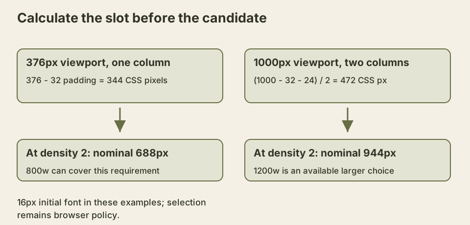
The figure uses illustrative layout dimensions rather than measured traffic data. It shows why viewport width alone is insufficient: column count, gaps, padding, and density all affect the useful resource size.
Sizes describes the slot, not a styling instruction
Changing sizes does not make the image visibly narrower. It changes the information supplied for selection. CSS must still constrain the image to its intended box, commonly with a block display, full available width, and automatic height.
An inaccurate value such as 100vw for a small sidebar image can encourage an oversized download. A value that is too small can encourage a resource that looks soft when stretched. Keep layout and image configuration together in a component or a clearly documented contract so they do not drift during redesigns.
The width and height attributes reserve an aspect ratio before the resource finishes loading. They are not a command to display the image at those exact dimensions when responsive CSS overrides its size. If all candidates share the same crop, one consistent ratio prevents ordinary image arrival from moving the content below it.
Resolution switching and art direction differ
The candidate list above changes resolution while preserving the composition. Sometimes a narrow layout needs a different crop because the important subject becomes too small. That is an art-direction problem, usually expressed through picture and source elements with media conditions.
A landscape group photograph and a close portrait crop are not interchangeable resolutions of the same composition. Test that the alternative remains accurate for every selected crop. If a crop removes the object named in the alternative, both the selection design and the text need review.
Format selection can also use picture sources. A browser may accept AVIF while another falls back to WebP or JPEG. This introduces another resource dimension, so avoid generating every possible format and width without considering storage, build time, and actual benefits.
Make the layout assumption executable
To reproduce the calculations, place two copies of the image element inside a div with class product-grid, directly inside the body of a small test page. The following CSS removes the browser’s usual body margin and gives that grid the exact padding, gap and cap used above. It is a fixture for this layout, not a global reset to paste into an unrelated application.
body { margin: 0; }
.product-grid {
  box-sizing: border-box;
  inline-size: 100%;
  max-inline-size: 1200px;
  margin-inline: auto;
  padding-inline: 16px;
  display: grid;
  grid-template-columns: minmax(0, 1fr);
  gap: 24px;
}
@media (min-width: 48rem) {
  .product-grid { grid-template-columns: repeat(2, minmax(0, 1fr)); }
}
.product-grid img {
  display: block;
  inline-size: 100%;
  block-size: auto;
}
The zero minimum in each grid track allows the image to shrink with its track instead of letting intrinsic minimum sizing widen the grid. The border-box rule includes the padding inside the 1200px cap. If you add a border, a sidebar, or another padded wrapper, the arithmetic changes. The 100vw expressions assume this grid uses the viewport’s available width until capped; putting it inside a narrower container breaks that assumption even if the image still looks neatly contained.
The exact uncapped numbers also assume that viewport units and the grid’s containing block have the same available width. A classic scrollbar introduced by automatic overflow can reduce the content width while viewport units still assume no scrollbar. The CSS Values specification describes that distinction. Check this condition in the target browser before treating the fixture arithmetic as an exact description of every page.
The Media Queries specification defines relative length units in media queries using initial values, influenced by user preferences rather than declarations in the page. Setting html { font-size: 32px; } is therefore not the same test as a browser whose initial font size is 32px. Keep that distinction when trying to reproduce the large-font case.
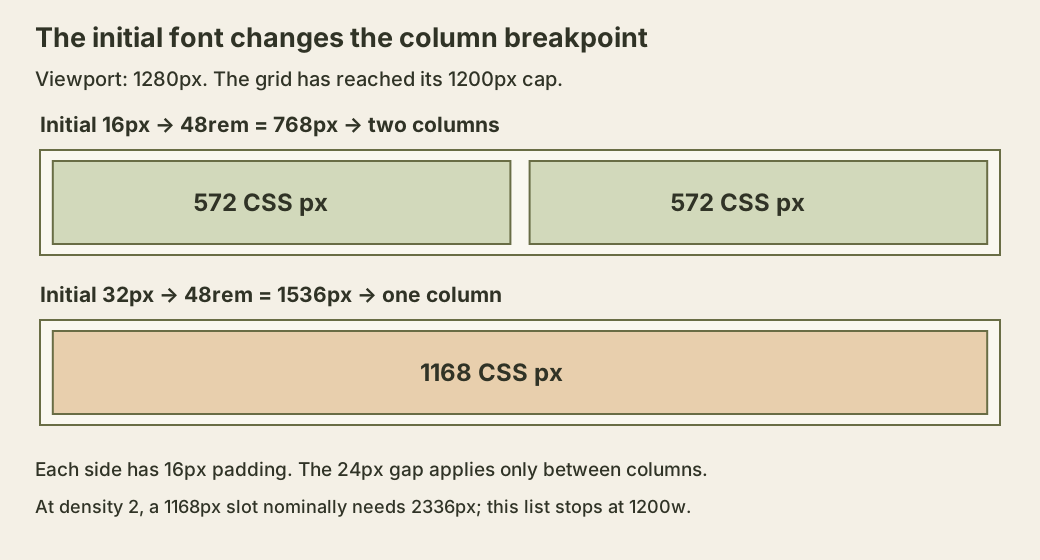
That larger slot exposes a limit of the candidate list. At density two, 1168 CSS pixels correspond to a nominal 2336 resource pixels, beyond the largest 1200px export supplied here. Correct sizes cannot create missing detail. If that combination matters for the actual image, consider a larger candidate and measure its cost. If the image is intentionally allowed to look less sharp at that density, make that a conscious quality decision rather than pretending the list covers every display condition.
Inspect the selected URL separately from the layout
With real files in place, run this in the browser console after the page loads. decode() waits for the current image to decode or rejects if it cannot. The currentSrc property identifies the selected URL; it does not itself prove that the file loaded successfully.
const image = document.querySelector('.product-grid img');
await image.decode();
console.table([{
  displayWidth: image.getBoundingClientRect().width,
  devicePixelRatio: window.devicePixelRatio,
  chosenUrl: image.currentSrc,
}]);
Compare the width with the expected 344, 472 or 572 CSS pixels under the corresponding ordinary-font fixture conditions. Then inspect the chosen file’s real dimensions and transferred bytes in the network panel. Do not infer its encoded pixel dimensions from a filename or use a URL as evidence of successful decoding. The HTML image-selection specification defines the descriptors and source-size machinery, while leaving user agents room in the selection process.
For an exercise, change the gap to 40px but leave sizes unchanged. At a 1000px viewport, each card is now 464px, while the old expression advertises 472px. Fix the expression’s subtraction from 56px to 72px and the capped two-column width from 572px to 564px. The exercise produces a small, explainable mismatch before any optimization service is involved. Repeat after changing a wrapper’s padding to see why the layout contract matters more than the names of the exported files.
Check a cold load at several widths
Use a local page with real candidate files and inspect the network panel. Test a narrow viewport, a two-column viewport, and the capped desktop width. Record CSS display width, device-pixel ratio, currentSrc, transfer size, and the visible result. A larger cached image can influence later observations, so distinguish a cold load from resizing an already loaded page.
Do not lazy-load the image you expect to be the main content visible immediately on arrival merely because a component defaults every image to lazy. Images far below the initial viewport have a different loading priority. The decision belongs to the image’s role on that page.
If the network still downloads a large resource, compare the actual rendered width with the first matching sizes condition. That comparison often reveals a layout mismatch more directly than adding another compression setting.